
Crime statistics can be overwhelming, but understanding them is crucial for making informed decisions about safety and security. According to a recent report, nearly 75% of adults in the United States are concerned about crime rates in their neighborhoods. This anxiety can be fueled by the complexity of crime charts, which often feature unfamiliar terms and confusing data visualizations.
For individuals who want to stay informed without panicking, learning how to read crime charts is essential. The good news is that deciphering these charts doesn't have to be daunting. With a basic understanding of the five most common chart types, anyone can decode crime statistics and make sense of the data. In this article, How to Read Crime Charts Without Panic, readers will learn to navigate crime charts with confidence, making informed decisions about their safety and security.
Understanding Crime Charts: Where to Begin

Crime charts can be daunting, but understanding their basics is key to decoding crime statistics. The first step is to familiarize yourself with the types of charts used to represent crime data. One common type is the bar chart, which displays the number of crimes committed in a given area over time. For example, a bar chart might show a spike in burglaries during the summer months.
Crime charts often display multiple data points, such as the number of crimes committed and the clearance rate. The clearance rate is the percentage of crimes solved by law enforcement. According to the FBI, the national average clearance rate for property crimes is around 19%. When interpreting a crime chart, it's essential to consider the context of the data being presented.
A pie chart is another type of chart used to display crime data. Pie charts show how different types of crimes contribute to the overall crime rate. For instance, a pie chart might show that violent crimes account for 20% of the total crime rate. To truly understand a pie chart, one must consider the specific crime rates being represented.
Effective crime chart analysis requires a deep understanding of the data being presented. By starting with the basics and familiarizing yourself with different chart types, you can decode crime statistics with ease.
Breaking Down Bar Charts for a Clearer Picture

Breaking down bar charts can help decipher crime statistics without inducing anxiety. A well-structured bar chart displays data in a clear and concise manner, making it easier to compare and analyze trends.
A bar chart typically features vertical or horizontal bars representing different categories, with the height or length of each bar indicating the value or frequency of the data. For instance, a bar chart might show the number of reported burglaries in a given city, with each bar representing a different neighborhood. According to the FBI, in 2020, there were approximately 1.4 million reported burglaries in the United States.
To accurately interpret a bar chart, consider the scale and units of measurement. A bar chart may display the number of incidents or the rate per 100,000 people. If the chart shows a significant increase or decrease in a particular category, investigate the underlying factors contributing to this trend.
When analyzing a bar chart, identify patterns and correlations between different data sets. For example, a bar chart may reveal a correlation between high crime rates and socioeconomic factors such as poverty and unemployment. This information can inform crime prevention strategies and resource allocation.
Decoding Line Graphs to Reveal Hidden Patterns

Crime Statistics Made Easy: Decoding 5 Common Chart Types Without Anxiety
When analyzing crime charts, one of the most common charts encountered is the line graph, which plots data points over time to reveal trends and patterns. A line graph is particularly useful for illustrating fluctuations in crime rates, such as the spike in burglaries during the summer months. By examining the slope and shape of the line, researchers can identify areas of concern and track the effectiveness of interventions.
According to the FBI's Uniform Crime Reporting (UCR) Program, line graphs can be particularly effective in displaying short-term trends, with 71% of law enforcement agencies using them to analyze crime data. By focusing on the peaks and valleys of the line, analysts can pinpoint specific events or seasonal patterns that contribute to crime fluctuations. For instance, a sharp increase in the line graph may indicate a hot summer, while a steady decline may suggest more effective policing.
While line graphs are powerful tools for revealing patterns, they require careful interpretation. A sudden dip in the line may not necessarily indicate a decrease in crime, but rather a shift in reporting practices or a change in the time of year. Researchers must account for these factors when analyzing line graphs and consider multiple sources of data to confirm their findings.
Making Sense of Pie Charts Without Getting Lost
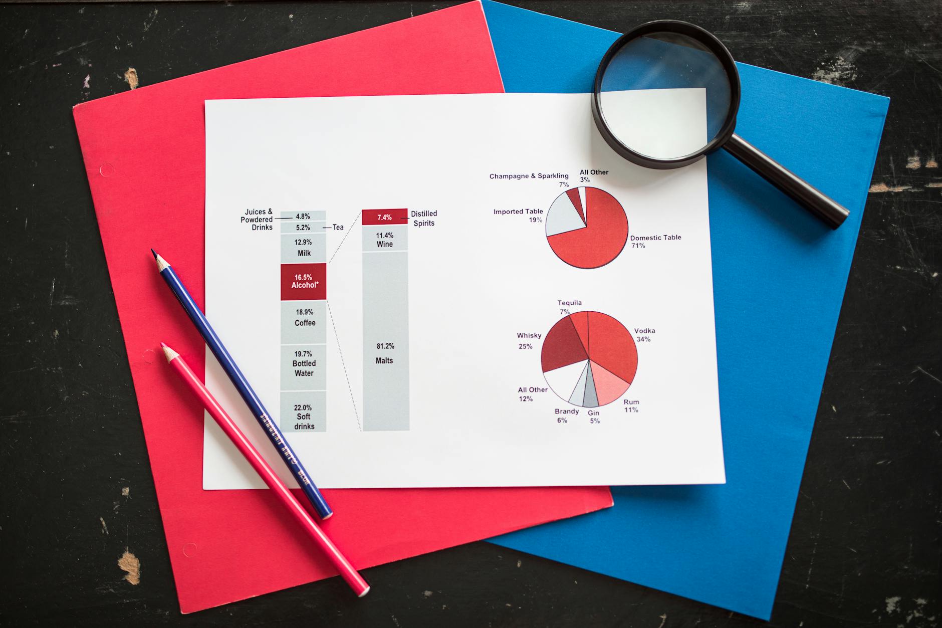
Pie charts are a common way to visualize crime data, but they can be overwhelming for those who are not familiar with them. A typical pie chart is divided into sections, or slices, that represent different categories of crime. The size of each slice is proportional to the number of crimes that fall within that category.
For instance, a pie chart might show that 30% of crimes in a given area are related to property damage, while 20% are related to violent offenses. According to the FBI's Uniform Crime Reporting (UCR) Program, which collects and analyzes crime data from law enforcement agencies across the United States, pie charts are often used to highlight trends and patterns in crime statistics.
When reading a pie chart, it's essential to look for the total number of crimes represented. This information is usually displayed as a percentage or a whole number. For example, a pie chart might show that 40% of crimes in a particular city are violent offenses, but the total number of crimes is 10,000. This allows the viewer to get a better sense of the severity and scope of the issue.
Turning Crime Data into Actionable Insights for a Safer Future

Crime Statistics Made Easy: Decoding 5 Common Chart Types Without Anxiety
Crime data is a crucial tool for understanding and addressing crime trends. By breaking down complex statistics into actionable insights, law enforcement agencies and community leaders can develop targeted strategies to reduce crime rates. For instance, a study by the National Institute of Justice found that crime rates can be reduced by up to 30% through community-based policing initiatives.
A common type of chart used in crime statistics is the bar chart. This chart displays the number of crimes committed in a specific area over a certain period. By analyzing the data, researchers can identify patterns and trends, such as an increase in burglaries during summer months. For example, a bar chart might show that burglaries peak in July and August, indicating that law enforcement agencies should increase patrols during these months.
To get the most out of crime charts, it's essential to look beyond the numbers. Consider the context and potential factors contributing to the trends. For instance, a sudden spike in violent crimes might be related to a new gang presence in the area. By understanding the underlying causes, law enforcement agencies can develop more effective solutions.
By decoding the data behind crime charts, communities can work together to create safer neighborhoods. By analyzing trends and patterns, residents can also take steps to protect themselves and their property. For example, a resident might notice a rise in car thefts in their neighborhood and take steps to secure their vehicle, such as installing a steering wheel lock.
Need this answered for your specific case?
Get a flat-fee consultation with a verified U.S. immigration attorney. Engagement letter on every paid consult.
Related guides
-
Crime Statistics Debunked: Separating Fact from Fiction in 10 Common Misconceptions
6 min read · Apr 12, 2026
-
One in Five Small Businesses Hit with Cybercrime Every Year, Statistics Reveal
5 min read · Apr 12, 2026
-
More Than 2 Million Americans Fall Victim to Fraud Every Year
6 min read · Apr 12, 2026
This guide provides general legal information and does not create an attorney–client relationship. Information accurate as of July 2026. Always verify current USCIS guidance before acting.